Over the last few weeks, we have been discussing all things branding. We have gone deep into the side of brand voice and touched on the importance of using story in your branding and developing core values for your brand.
Today, I am going to switch gears and deep dive into COLOR theory for branding and how it should inform your brand color palette.
Even though brand visuals can sometimes feel like the more “important” or “fun” side of branding, I implore you to start with your brand voice and pin down your messaging before you transition to the visual side. Click here to head back to my first post, where I explained the difference between brand voice and brand visuals.
While colors & pretty graphics do matter (you’ll learn this over the next few weeks), the actual soul & identity of your brand resides in your message.
But, assuming that you dug into that over the past weeks, I’m going to move on into the visual side of your branding and share tons of tools, resources & info you can use to up-level your visual branding.
Choosing a Brand Color Palette
The first step to establishing branding for your business is creating a brand color palette.
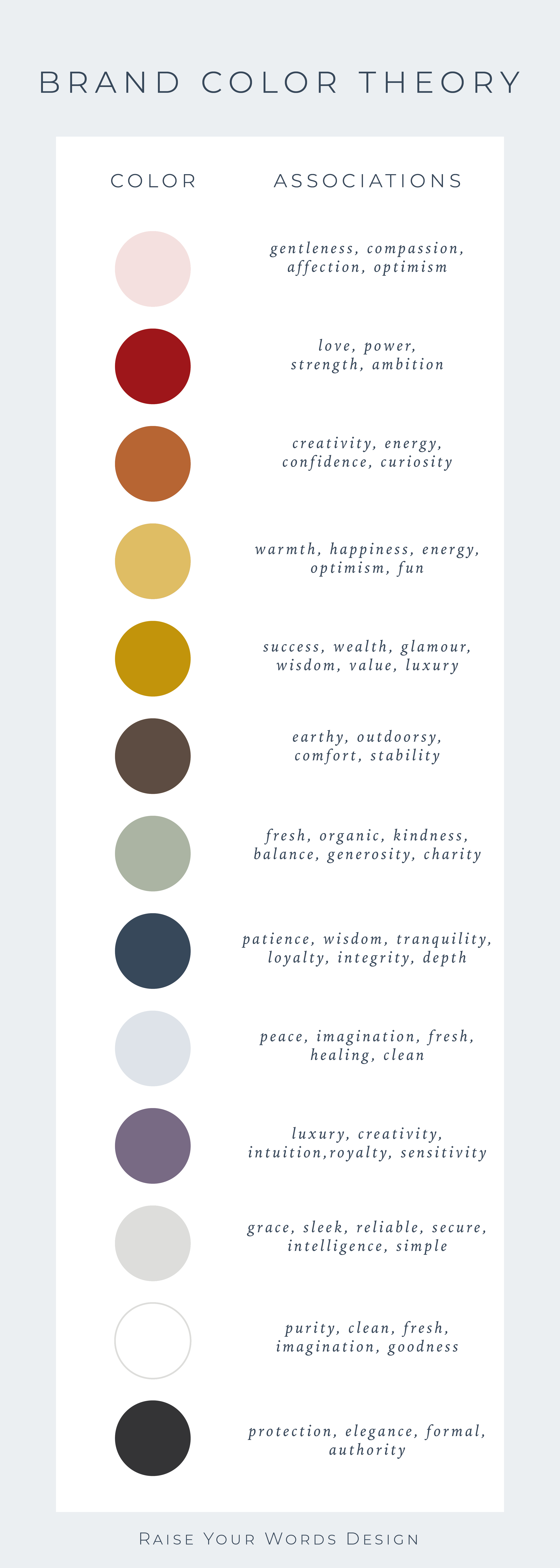
While it may be tempting to just choose your favorite colors, it’s really important to choose colors intentionally based on their energy.
Check out the graphic below that shows the “vibe” associated with different colors. NOW, scroll through those words and find some that stand out to you as important to you (your values) or that align with the values of your ideal client.

For my brand, blues felt right for a few different reasons. First, I was drawn to blue because blue has always been my favorite color to wear and decorate my house with.
That wasn’t quite enough of a reason to use it for my brand, so I dug a bit deeper into the color. As a wedding stationer, I wanted to choose colors that are relevant in the wedding industry, so my prospective clients could really see a fit with me and their ideal aesthetic. Dusty blue and navy blue are HUGE colors in the wedding market right now, so there was a second vote for blue!
Thirdly, I did some digging on color theory and the meaning and energy behind shades of blue. While blue can be associated with sadness, it can also be connected to intuitiveness, depth, and freshness. All of those concepts really speak to the ideal identity of my brand, especially with my core values of Soul and Authenticity.
So, blue it is!

Your Homework
Before we get into the logistics of creating a color palette (and pulling all your color codes), I’d like you to start with just browsing, absorbing and considering different color options.
If possible, I encourage you to experience color through nature, travel, or even just a walk in your local downtown. There’s so much great color inspiration in nature, and it really is the best place to start.
Another idea is to head over to Home Depot and browse through paint swatches. Grab some that inspire you and leave them on your desk for a few days. You can use these as an in-person inspo board when you’re actually choosing your final colors.
The third option for finding color inspiration is a website that is filled with color palettes. You can categorize by season, color, and inspiration source. Check it out here!
I’d like you to spend the next week noticing, considering and comparing color options for your brand. Next week, I am going to teach you all about color codes – why they matter & how to find them. I will also be sharing a FREE template to store your brand color palette for future use!

leave a comment