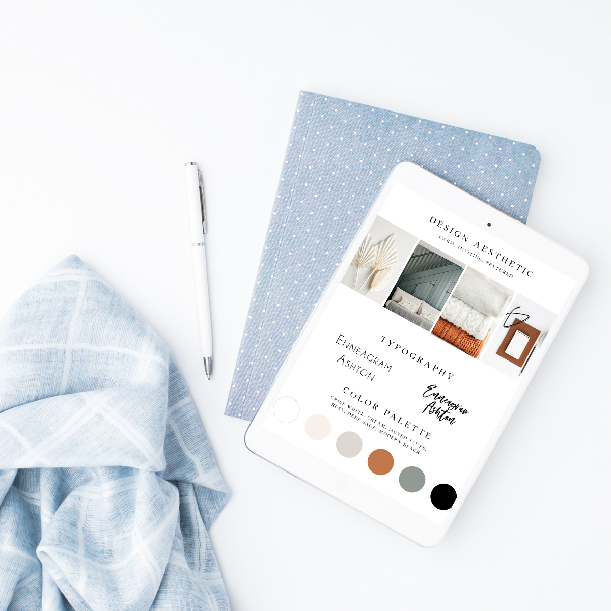
When you first put your new small business out into the world, it can be hard to create a consistent brand look that represents you.
Many small business owners find themselves trying to create cohesive branding by looking to see what others in their industry are doing. Or, if you’re like me, you may have just chosen a few colors you like and claimed those as your “brand colors”.
While there isn’t one right way to do this, there are some best practices that will help you create brand recognition and feel like you have it all together.
Tip 1: Be sure to create color variation.
Your brand color palette should range from 4-7 colors. If you’re hoping to establish brand recognition, you don’t want to have soooo many different colors that no one connects them to you.
You should have one dark color that is used for contrast. This can be black, charcoal, navy blue, or another deep shade of your favorite color.
Choose a range of 2-3 neutrals or light shades. These are best for backgrounds, borders and design elements. Think light gray or a pale blush.
Lastly, a pop of color! Pops of color are shown to draw people’s attention and entice them to read something or click a button. I always encourage my branding clients to identify one color that we can use as a pop both on marketing materials and websites!
Tip 2: Save your color codes!!
Create a Google Doc where you save all of your brand color codes. I recommend using Pantone’s ‘Find a Color’ tool to choose your brand colors. When you click on a color square, it will pull up RGB, CMYK and HEX codes.
RGB and HEX codes are both good to have on file for when you are creating digital designs. I find HEX codes to be the most important to have, as both Canva and ShowIt work with HEX codes. As you are designing, you can enter the HEX codes of your brand colors, and it will be the exact same color across all of your designs. You can also save HEX codes to your Canva account, so they’re there for you to grab anytime you’re designing.
CMYK codes are great to have on hand for any printed materials. If you work with a stationer or professional printer, they will likely ask for your CMYK codes to ensure the colors match your brand perfectly.
Creating brand colors requires minimal effort but makes a huge difference in brand recognition and cohesiveness. It will help you exponentially in establishing your brand identity and connecting to your ideal clients. If you have any questions or would like my feedback on your color palette, please feel free to reach out!
Also, check out the Color Palette Template resource I have linked for you below!
How to use: Click the link and make a copy of the template. Click the circles and change the colors to your brand colors. Find and add the color codes using the Pantone resource.
Want more helpful tips on branding and brand identity?
Click here to join my email list, where you’ll get all the best resources as I create them!
Comment below if you have specific questions related to branding. I’d love to create my next blog post answering your question!

https://waterfallmagazine.com
Hi there, yup this post is genuinely fastidious and I have learned lot of things from it on the topic
of blogging. thanks.
Hi there! This was very helpful. I have two sites that I have already purchased and am having trouble with which to choose. I have a dark and moody and a light and airy. But the colors are pretty much the same. I’m hoping to use that is an additional resource to hone in on the colors a bit more so they are richer. Thanks!
[…] Create a brand color palette (check out this blog post for more tips on brand colors) […]
Like!! Really appreciate you sharing this blog post.Really thank you! Keep writing.