
Let’s talk about fonts for logos and branding. I bet right now without even having to Google it, you could mentally picture the font used by Target in their logos and marketing. What about Facebook? Or Ford?
Fonts, also known as typefaces in the graphic design world, are a central piece to the visual identity of your brand. You can significantly increase brand awareness and credibility by choosing 2-3 brand fonts that you use across your designs.
I call this a Typeface Collection, and I use it for logos, marketing materials, social media posts, and websites. Fonts have style and therefore can speak to your personality. Choose fonts that you love and that reflect the style of your brand.
If you want your brand to be known for luxury and formality, choose a clean serif font paired with a formal script. If you want to have more of an eclectic, modern vibe, choose a fun brush script and pair it with a simple sans serif.
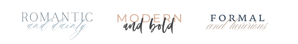
Font Pairings
Check out these examples of fun font pairings:
3 Action Steps
A few things you should know about implementing a typeface collection into your brand:
- Be sure to research the rights you have to use a particular font. Some fonts are labeled for personal use only and will need to be purchased in order to use on your website. If you’d like to purchase rights to fonts, I recommend Creative Market or MyFonts.
- Similar to your color palette, it’s important to save your Typeface Collection somewhere you can easily access it. You could create a Google Doc where you save the names, so you have it for easy reference.
- Always choose fonts that are legible. Sometimes fun flowy script fonts can be appealing, but what’s the point of a font if you can’t read it? Especially on your website, where everyone skins and skips, you want your content to be accessible. I recommend using mostly serif or sans serif fonts and only using script fonts for LARGE heading-sized text that can be easily read OR for copy that is clever/cute but not the most important part of the page (i.e. no big deal if no one ever reads it…).
If you have any other questions about fonts or choosing your brand fonts, comment below and I’d be happy to answer them 🙂
Interested in working with me for your small business branding? Head here to learn more about my packages!

I really like the font pairing in the middle! Are you able to share the names of these fonts? Thanks!
Hey Melissa! The sans serif font is called Montserrat and the brush lettering is called Opulence (which can be downloaded from Creative Market).
What is the purpose of font color?
Color is sometimes used to convey meaning beyond the basic text. In a course syllabus, for example, you may use color to emphasize an important statement. Or, on a PowerPoint slide showing a multiple choice question, you might show the correct answer in green and color the incorrect answers in red.
Fonty Fonts
What would cause the font on my computer to look blurry?
Adjust DPI Scaling
Blurry text might be the result of incorrect global text scaling settings. Windows attempts to scale your text so that it remains readable on high-resolution displays. For example, if you’re using a 27” 4K display, the text would be almost unreadable without 20/20 vision
Fonty Fonts
How do I change the default font and size in Publisher?
Set defaults for new text boxes in a publication
Right-click the text box that has the formats you want to use as the default.
On the shortcut menu, click Format Text Box, and then click the Colors and Lines tab.
Select the Apply settings to new text boxes check box.
Click OK.
Fonty Fonts
What is the most readable font size for body text on a website?
around 16px to 18px
Optimal font sizes for desktop
Body text — Font sizes should be around 16px to 18px for legibility (or 1.6rem to 1.8rem using our sizing rules mentioned above). If you can afford to go a bit larger, then even 21px can be pleasant to read.
Fonts Bee